Studi — UX/UI LMS Overhaul
Studi is a 100% online school, offering a wide range of training programs. However, challenges such as low course completion rates and limited user engagement highlighted the need for a complete UX/UI and technical architecture redesign.
Industry
Education
Date
2023
Client
Studi
My role
UX Researcher, UX/UI Designer
“How can we optimize the
Learning Management System (LMS)
to improve user experience,
increase course completion rates,
and foster self-learning?”
Objective: Optimize the plateform’s learning experience, boost retention and integrate self-assistance mechanisms to enhance autonomy.

Design Process — Overview
-

Discover
Field immersion,
User interviews, System audit,
Benchmarking -

Define
Target workshops,
Testing and interviews, Surveys, User profiles, Goals & pain points -

Develop
Co-design workshop, Information architecture, Wireframes,
Prototyping -

Define
Testing framework,
Usability testing, Recommendations, Implementation
Discover
Objective: Understand the context, needs, and expectations of users, as well as the constraints of the problem to be solved.
This involves both qualitative and quantitative research methods. Data is collected and analyzed to identify opportunities, challenges, and avenues for innovation.

Research Strategy
Establishing a Research Strategy at the beginning of the project is essential to ensure that design decisions are grounded in real user needs and industry best practices. By conducting an in-depth analysis of existing LMS/LXP platforms, learning methodologies, engagement mechanisms, and community dynamics, we gain a holistic understanding of how users interact with digital learning environments.
Define
Objective: Synthesize the collected information, clearly articulate the problem, and define the project's objectives and success criteria.
This stage uses visualization tools such as personas, user journeys, and empathy maps. The problem is framed as an open question to guide the next phase.
Personas & Journey Mapping
Through user interviews, we identified key challenges learners face and grouped them into 4 distinct personas. Each profile represents a different learning journey, allowing us to tailor the platform’s UX/UI to address specific needs and pain points effectively.

Post-bac student
Looking for structured learning


Reorientation student
Seeking flexibility and clarity
In order to deeply understand each learner's experience, we developed Customer Journey Maps for each persona:
Career switcher
Requiring strong support and motivation

Upskilling professional
Focused on efficiency and goal-driven learning

Key findings:

These maps help highlight critical touchpoints where users face challenges or moments of engagement. By analyzing these interactions, we were able to pinpoint key user needs, frustrations, and opportunities for improvement.
-
Learners feel isolated and need better guidance.
-
Users crave more engagement and social interaction. There was no seamless way for leaners to connect, share experiences and get peer support.
-
Many struggle to find and understand available learning materials.
-
The interface was unintuitive, making the navigation discouraging.
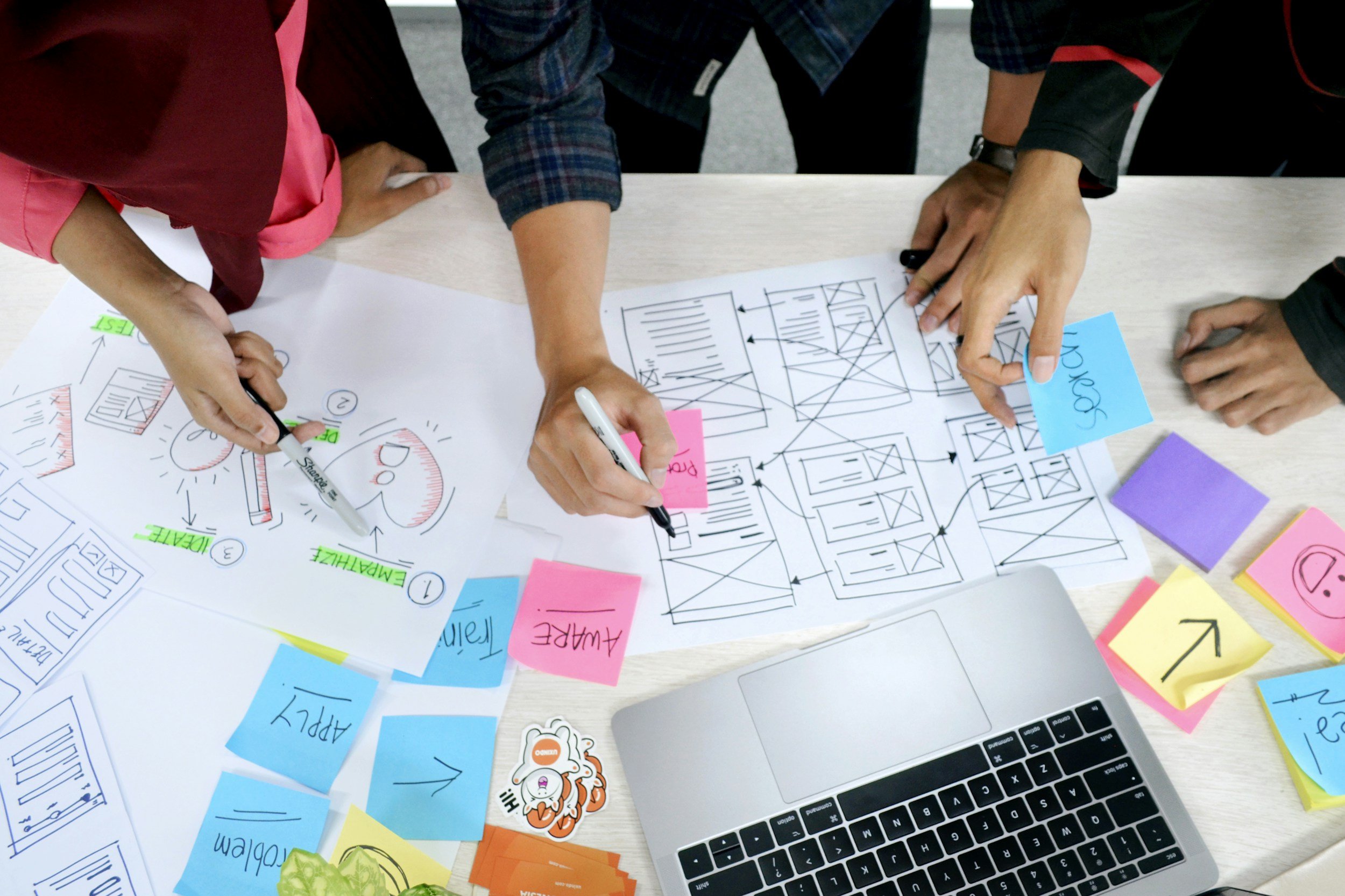
Develop
Objective: Generate solution ideas based on collected insights, using creativity and collective intelligence. This phase involves brainstorming techniques such as mind mapping, sketching, and scenario building.
The most promising ideas are selected and combined according to the objectives and criteria defined in the previous phase.
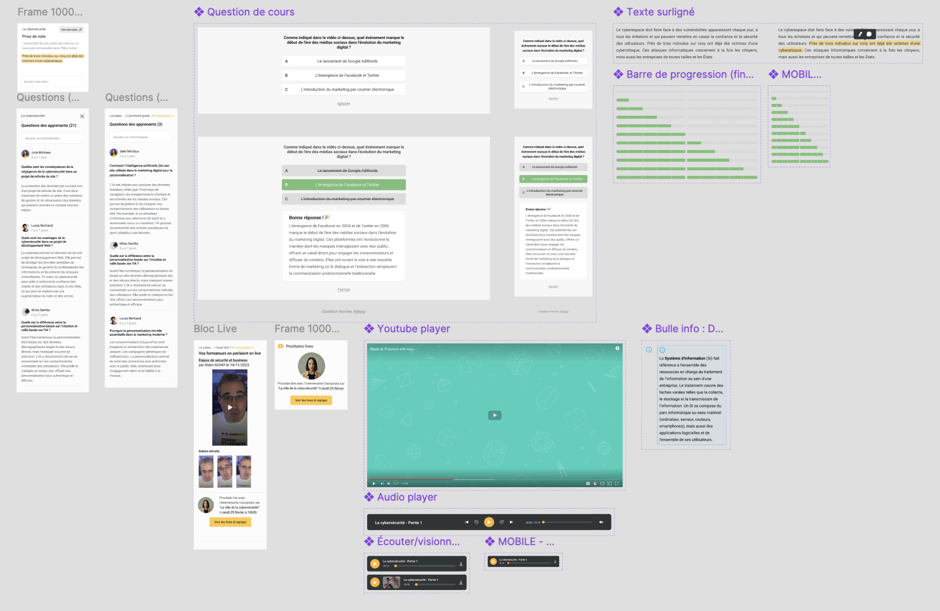
To design the new version of this LMS, we adopted a component-based approach to ensure scalability, consistency, and efficiency in the user experience.
We first structured the platform by creating wireframes to define the overall architecture and user flows. This step allowed us to focus on usability, information hierarchy, and navigation patterns before refining the visual details.
Once the wireframes were validated, we moved to Figma to build a comprehensive design system, developing reusable UI components such as buttons, cards and navigation elements.
Old version

New version

Lack of support 🚫 → Personalized learning paths ✅
We introduced a personalized onboarding experience that adapts the learning journey to each user’s goals. The platform now offers customized recommendations based on their profile and progress.
Unclear resources 🚫 → Improved content organization ✅
We restructured the course materials with a centralized dashboard offering quick access to modules, a smart search and filtering to help students find resources effortlessly and an adaptive content suggestions based on user behavior.
Lack of interaction 🚫 → Community features ✅
We integrated live Q&A forums where students can get answers in real-time and peer study groups inspired by successful models.
Low engagement 🚫 → Gamification & progress tracking ✅
We implemented milestones and badges for motivation, real-time progress tracking to keep users engaged, streaks and challenges to encourage consistency in learning.
Deliver
Objective: To develop and test solutions, using prototypes. To do this, we use validation methods such as user tests, feedback, impact measurements, etc.
Solutions are evaluated and improved on the basis of the feedback and results obtained.
Usability test results:
✅ Increased course completion rates
✅ Enhanced user engagement through gamification
✅ A more accessible and intuitive platform
Tools: Figma, Notion